What a logo project in Kuwait actually includes
Most people asking for a logo design in Kuwait picture a single image: the thing that goes on the sign. In practice a logo is a small family of drawings that have to agree with each other. There is the primary logo, the version you show when there is room. There is a horizontal lockup for the top of a website, a receipt or a shop fascia, and a stacked lockup for a square Instagram post or a cup. There is an icon or monogram that survives being shrunk to the size of a phone app or a browser tab. And in Kuwait there is the Arabic version, which is not an extra but half of the job.
A logo project with us covers all of those, drawn together so they share the same weight, spacing and character. It also covers the decisions that sit under the drawing: one or two brand colours with their print and screen values, the typefaces that go with the logo in Arabic and English, and the rules for how much clear space it needs. Without those rules the logo starts to drift the first time somebody else uses it.
What it does not cover is the whole identity: packaging, menus, uniforms, signage design and a full brand book. Those sit in a full identity project on our branding page. Many businesses start with the logo, live with it for a season and then extend it, and that is a sensible order. The logo is built so it can grow into the system later without being redrawn.
Everything is delivered in 2–3 weeks from the signed brief, and the price is quoted per scope and fixed before we start, so the number does not move when you ask for the stacked version or the Arabic lockup. If you are unsure whether you need a logo or a complete identity, the guide on logo vs brand identity walks through the test we use with clients.
The lockups you get back, and why each one exists
A lockup is simply a fixed arrangement of the logo's parts: the symbol, the Arabic name, the English name and sometimes a tagline. Each one exists because a real surface demands it. The horizontal lockup is for wide, short spaces: the strip above a shop door in Shuwaikh, the header of a website, the footer of an invoice. The stacked lockup is for squares and circles: an Instagram profile picture, a sticker on a takeaway bag, the lid of a cup.
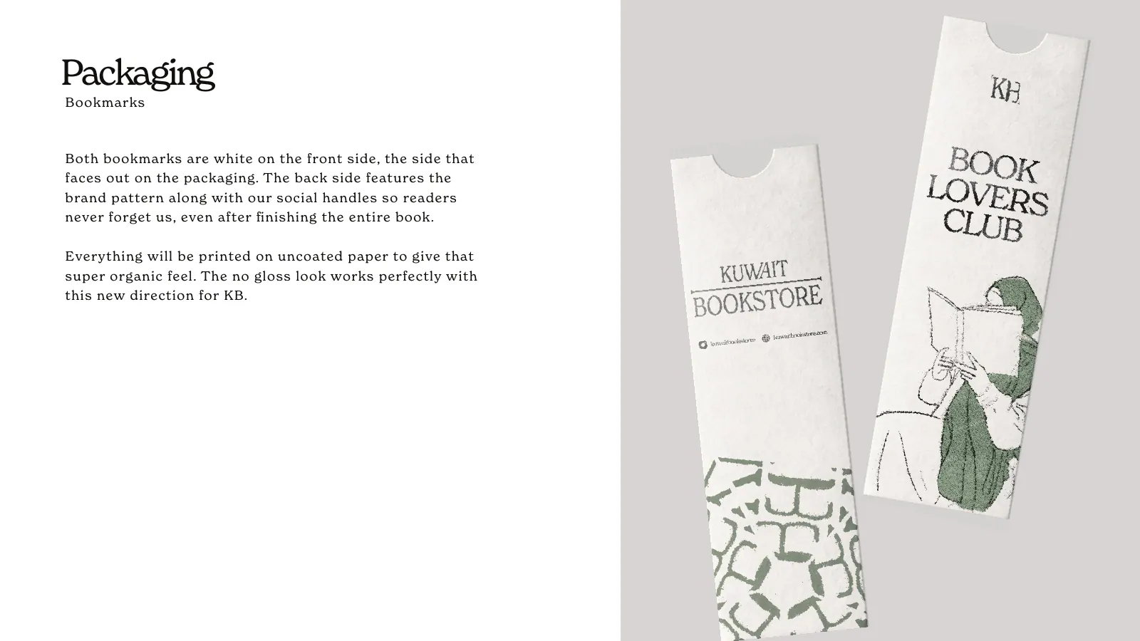
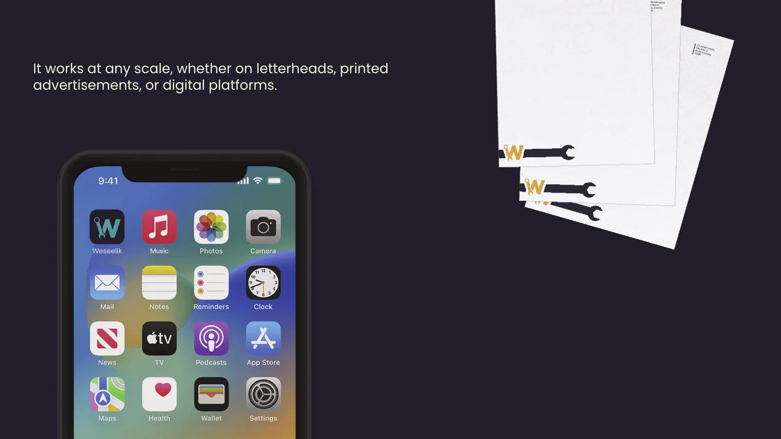
The icon is the hardest piece and the one most often skipped. It is what appears on a phone home screen, as a browser favicon, as a WhatsApp Business profile photo and on the corner of a delivery-app tile. At that size a full name becomes a grey smudge. The icon has to be one clear shape that still says who you are. Sometimes it comes from the first letter, sometimes from a symbol in the logo, sometimes from a stamp. For Kuwait Bookstore the portfolio shows a custom serif wordmark paired with a KB ink-stamp logomark, which is exactly this split: a wordmark for room, a stamp for small spaces.
Then there are the language versions. Some brands show Arabic and English side by side, some stack one above the other, some keep separate Arabic-only and English-only versions for surfaces that need just one script. We decide which combinations you need from where the logo will actually appear, rather than handing over a dozen variations nobody will use.
Finally there are the colour versions: full colour, one colour, white on dark and black on light. A logo that only works in its full palette fails the day it goes on a black uniform, a single-colour stamp or an embossed box. Each version is tested before it is delivered, not invented later by whoever needs it.
Where a logo has to work in Kuwait
A logo is judged in the places customers actually meet it, and in Kuwait those places are specific. The first is the phone. Most new customers will see your logo inside a circle on Instagram, Snapchat or TikTok long before they see your shop, so the stacked version has to sit inside a circle crop without losing its edges. The second is the delivery app. On Talabat and Deliveroo your logo shares a scrolling list with dozens of others, shrunk and often placed on top of a food photo.
The third is the storefront, and here the Kuwait sun is a real design constraint. A sign facing the afternoon sun in Salmiya or on a Kuwait City street washes out pale colours and thin strokes. A logo with hairline details or a light grey on white looks elegant on a laptop and disappears on a fascia in July. We check the logo at sign scale, in strong light and lit at night, because most signage here is illuminated and read from a car.
The fourth is print. Kuwait printers will produce your business cards, bags, stickers and boxes, and each process has its limits: fine lines fill in on cheap paper, small Arabic dots vanish on embroidery, gold foil needs solid shapes. The logo is drawn with those limits in mind, so the printer does not have to simplify it for you.
The fifth is the screen where people pay. Your logo appears on your website or Shopify store header, on the order confirmation and in the WhatsApp chat where customers ask about their order. None of these surfaces is exotic, but a logo designed only as a nice image on a white artboard rarely passes all five. Ours is tested against each before you see the final.
When a logo alone is enough
We would rather tell you this upfront than sell you a full identity you do not need yet. A logo on its own is enough when the brand appears in only a few places: an Instagram account, a WhatsApp Business number, a simple website and a business card. A home bakery taking orders through direct messages, a consultant, a personal trainer or a small online shop testing a product can all run well for a long time on a good logo, two colours and one typeface pairing.
It is also enough when the product itself does the talking. If you sell through someone else's store, or your work is a service people find through recommendations, the logo mostly needs to be recognisable and consistent. Spending on packaging systems and brand books before you know what sells is the wrong order.
A logo stops being enough when the number of surfaces grows. A storefront, printed packaging, a menu, a second branch, staff uniforms or an app each add places where someone has to make design decisions. Without a system, every supplier makes them differently: the printer picks a font, the signage maker picks a shade of green, the app developer crops the logo. That is the point to extend into a full identity, and because our logos are built with that in mind, extending them does not mean starting over.
If packaging is on your list, it has its own page, packaging design, because boxes and labels bring dielines and printer requirements that a logo project does not cover. A useful exercise before you decide: write down every place your brand will appear in the next twelve months. If the list fits on a sticky note, a logo is your project.
The files you receive at the end
The handover is where a lot of logo projects in Kuwait quietly fail. The owner receives a JPG over WhatsApp, maybe a PNG, and months later discovers the signage maker needs a vector file, the developer needs an SVG and the box printer wants a PDF in CMYK. The designer has moved on, the source file is lost, and someone redraws the logo slightly differently.
We hand over a complete, organised set. Every lockup in every colour version, as a vector master (AI, PDF and SVG) and as high-resolution transparent PNGs. Print colours in CMYK and, where the palette needs it, a Pantone reference, alongside the screen colours in RGB and hex. The icon exported at the sizes an app, a favicon and a social profile need. Fonts outlined in the logo files, so they open correctly on a computer that does not have the typeface installed.
Files are named so that a person who has never spoken to us can find the right one: language, lockup, colour, format. A one-page usage sheet explains clear space, minimum size and the versions not to use. If you want the reasoning behind each format, our guide to logo file formats explains what AI, SVG, EPS, PDF and PNG are for and which supplier asks for which.
You own the final files. Keep a copy somewhere other than one person's phone: a shared drive, your email, a USB stick in the office drawer. That copy is what saves you from paying for the same logo twice.
How a logo is drawn, from the brief to the final mark
A good logo starts with a short list of facts, not a mood board. Who buys from you, where they first see you, what you are called out loud and in Arabic, who your nearest competitors are, and where the logo must appear in its first year. The brief also pins down what the logo must not look like: the green every pharmacy in the area uses, the crown half the perfume shops have, the coffee bean every café puts somewhere.
From there we work on direction before detail. Two or three clearly different routes, each explained in a sentence: a wordmark that leans on drawn lettering, a symbol built from an idea in the business, a stamp or monogram that carries the small sizes. You pick one route to develop, which keeps feedback focused. Choosing between three finished logos usually ends with a request to combine them, and the result pleases nobody.
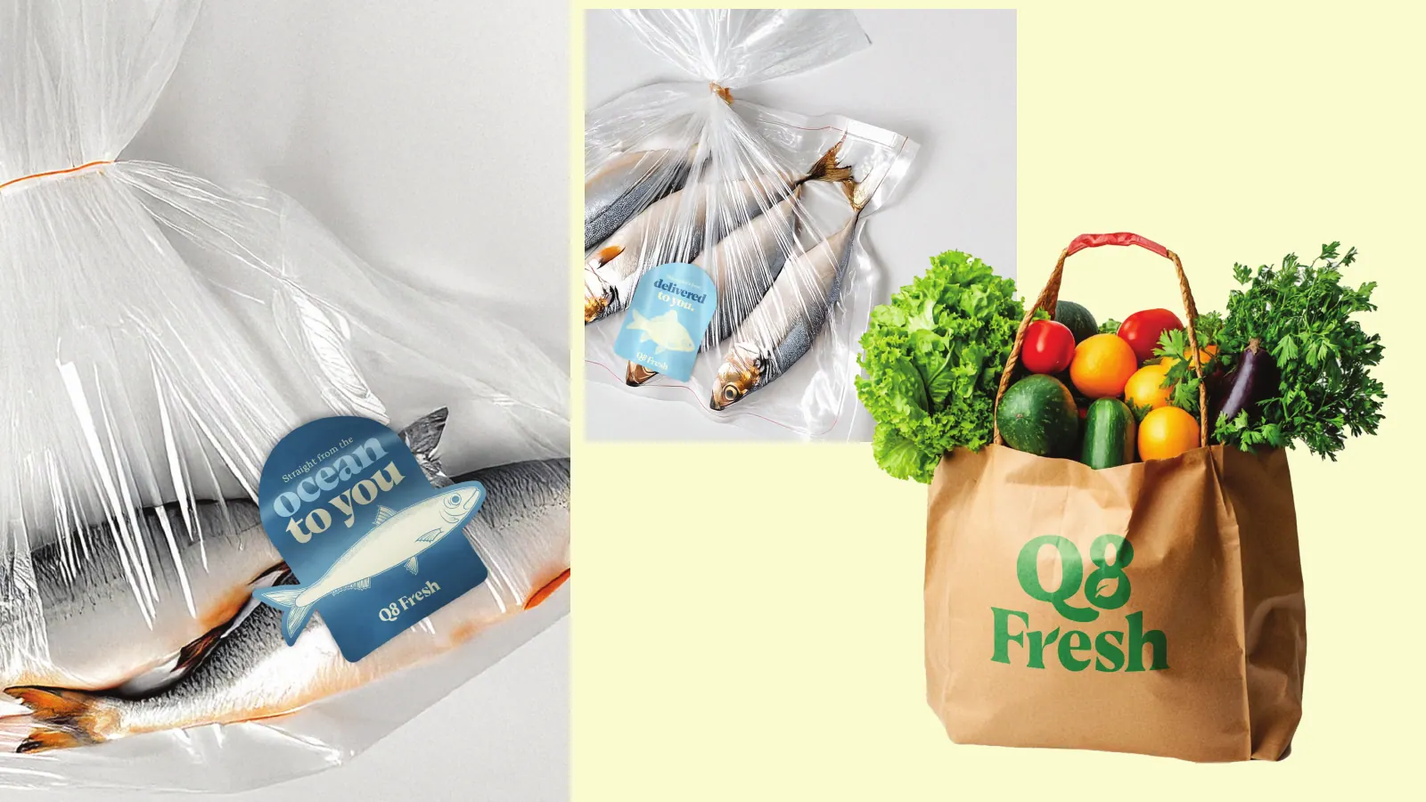
Then the chosen route is drawn properly, in both languages at once, and tested at the sizes and surfaces described above. This is where most of the craft goes: the curve of a letter, the gap between the icon and the name, how the Arabic sits against the English baseline. The portfolio has examples of how far one logo can be stretched. Q8 Fresh is a friendly serif logo with fish, leaf and meat variants, so a single grocery brand can label three very different counters.
Feedback happens in planned rounds, booked in the calendar from the start. That rhythm is what lets us deliver in 2–3 weeks: one decision maker, comments gathered in one place, and no surprise stakeholder appearing at the final presentation.
Owning your logo: templates, originality and trademarks
A logo is only useful if it is yours. Many businesses in Kuwait start with a template from a logo app, and there is nothing shameful in that. The problem is that a template is, by design, available to everyone. It is common to find the same leaf, the same coffee cup or the same crown on two businesses in the same area, sometimes in the same mall. When customers cannot tell you apart, the logo is working for both of you, or for neither.
Every mark we deliver is drawn for your business, not assembled from stock elements, and we check the direction against what is already visible in your category in Kuwait before we develop it. That check is practical, not legal: we look at competitors, at Instagram accounts in the same niche and at shopfronts in the areas you trade.
Formal protection is a separate step. Trademark registration in Kuwait is a Ministry of Commerce and Industry process, and whether a mark can be registered is that ministry's decision, not ours. We do not give legal advice, but our guide to trademark registration in Kuwait explains how the process works and what you will need, and we supply the clean artwork files that an application typically asks for.
Ownership also means the editable sources. Ask any designer, including us, to confirm in writing that you receive the vector masters and the right to use them. If you ever move the work to another agency or bring design in-house, those files are what let the next person continue rather than start again.
How to choose a logo designer in Kuwait
Whoever you hire, five questions sort the serious options from the rest. First: can you show me Arabic logos you drew, not just English ones with an Arabic font typed underneath? Second: what files will I receive, in which formats, and can I see a sample handover folder? Third: will I get an icon that works at app and favicon size? Fourth: how many directions will I see, how many feedback rounds are included, and what is the schedule? Fifth: is the price fixed before work starts?
A strong freelancer is often the right call for a logo, and we say so in our comparison of a branding agency or freelancer. The difference shows when the logo has to be rolled out across packaging, signage, an app and ads in the same season, because then you need people who produce every application and keep them consistent.
Look at portfolios for evidence of range, not just polish. Can the designer do a quiet literary wordmark and a loud food brand? Have they handled a logo that needed variants, like a stamp or a set of category marks? Do the Arabic versions look drawn or pasted? Our own work is on the branding page, with each project listing exactly what was delivered.
Finally, pay attention to the questions the designer asks you. Someone who starts sketching before asking where the logo will appear, what your customers call you, or who your competitors are is designing for their portfolio, not your business. When you are ready, a short message through our contact page or WhatsApp is enough to get a scoped, fixed quote.