Refresh or rebrand: two different jobs
Most owners who call us about a rebrand actually need one of two quite different projects, and the price, the risk and the switchover all depend on which one it is. A refresh keeps the name, the core shape of the mark and the colours customers already link to you, and fixes everything around them: the type, the Arabic version, the spacing rules, the way the logo sits on packaging and on a phone screen. A rebrand changes something customers will notice straight away, such as the name, the symbol, the colour they use to find you on a shelf, or the audience the brand is speaking to.
The test we use is simple. If customers already recognise you and the problem is that the brand looks inconsistent, dated or awkward in Arabic, you need a refresh. If the business itself has changed, because you added a category, moved upmarket, merged with another company or outgrew a name that only fits the first product, then a refresh will polish a message that is no longer true, and you need a rebrand. Our guide on when to rebrand your business walks through the signs in more detail, including the reasons that feel urgent but are not reasons at all.
Getting this right first saves money in both directions. Owners who rebrand when a refresh would do throw away recognition they spent years building on Instagram and on the street. Owners who refresh when the business has really changed end up paying twice, once for the polish and again a year later for the rebuild. We will tell you which one we think you need in the first conversation, and if the honest answer is a set of rules rather than any design work, we will say that too.
There is also a middle path that suits many Kuwait businesses: keep the name and the colour, redraw the mark so it works in Arabic and English at every size, and introduce a second symbol for a new line or a delivery-only kitchen. That kind of evolution carries the old brand's recognition into new places without forcing customers to learn you again.
What to keep: the recognition you already paid for
Every brand that has been trading for a few years owns something in customers' heads, even if the owner is tired of looking at it. It might be a colour, a shape on the bag, the way people pronounce the name, a nickname customers use in WhatsApp messages, or the corner of the Avenues where they always find you. We call this brand equity in the plain sense: the shortcuts customers use to recognise you without reading. A rebrand that throws those shortcuts away makes you a new business overnight, and new businesses have to pay for attention again.
So the first thing we do in Week 1 is an inventory of what is actually doing work. We look at every surface the brand appears on, we read how customers tag and mention you on Instagram and Snapchat, and we ask you what people say when they recommend you to a friend. The DIY version of this is worth doing before you even contact a designer: ask ten customers what they call you and what they remember about you. If they describe the colour of your box or the shape of your sign, that element has earned its place in the next version.
Colour is usually the strongest single thing to keep. Customers scanning a Talabat list or a crowded shelf in a co-op find you by colour long before they read a word, and changing it means every one of them has to search for you again. Shapes come next, especially a distinctive symbol on packaging. Names are the most expensive to change, because they live in customers' phones, in Google Maps reviews, in delivery-app search and in your trademark file. We keep as much as the new strategy allows, and we tell you exactly what each change will cost you in recognition.
Keeping something does not mean keeping it unchanged. An old mark can be redrawn so its curves are cleaner, its Arabic letters are properly built rather than typed, and its proportions hold up at the size of an app icon. Customers will feel it is the same brand, only sharper. That is often the most valuable outcome of a project: the recognition carried over, and the weaknesses quietly fixed.
What to drop, and how to tell
The things worth dropping are usually the ones that make every supplier's job harder. A logo with fine lines that disappear when a Shuwaikh signage maker cuts it in acrylic. A gradient that prints as a muddy band on a paper cup. An Arabic version set in a free font that fights the English mark on every bilingual surface. A tagline written for the business you were five years ago. None of these are recognised by customers; they only show up as small failures across hundreds of applications.
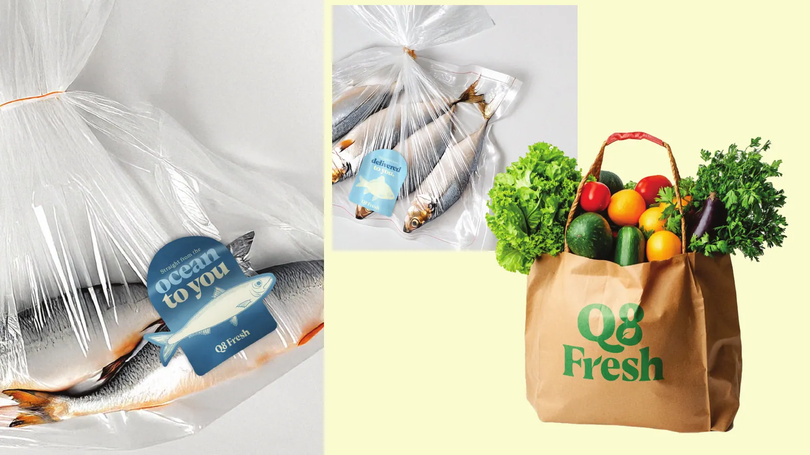
We also look for elements that tie you to a category you are leaving. A juice bar that now serves full meals, a grocery that now runs three counters, a consultancy that now sells software: each of these needs a brand that can stretch, and anything that pins you to the old offer goes. The Q8 Fresh identity shows the kind of structure that solves this, with a friendly primary logo and fish, leaf and meat variants so one grocery brand can label three very different counters.
Then there is everything that grew without a plan: the third shade of green a printer mixed by eye, the Instagram highlight covers someone made in an afternoon, the menu font that is different in each branch. A rebrand is the moment to retire all of them at once. We list each one in the switchover plan with its replacement, so nothing old survives by accident in a drawer or a template folder.
What we do not drop lightly is anything customers use to find you. If people search for your old name on Google or in a delivery app, the plan keeps the old name searchable for a period, for example as a line under the new name in the listing description, so loyal customers are not lost in the move.
The switchover map: every surface, in order
The risk in a rebrand is rarely the design. It is the months afterwards when the new logo is on Instagram, the old one is on the sign, a third version is on the Deliveroo tile and the cups in the stockroom still carry the old colours. Customers see two brands and wonder whether you changed owners. That is why every rebrand we deliver includes a switchover map: a list of every surface, who changes it, what file they need and the date it flips.
For a typical Kuwait business the map covers the storefront and mall signage, which has the longest lead time because it involves a signage maker, landlord approval in malls such as the Avenues, and sometimes a permit the client handles. Then packaging and printed stock: cups, bags, boxes, labels, menus, business cards and receipts. Then digital profiles: the Instagram, Snapchat and TikTok handles and profile pictures, the WhatsApp Business profile, Google Maps, the website and the Shopify store if you have one.
Next come delivery apps and marketplaces. Logo, cover image and listing name changes on Talabat and Deliveroo go through the platform rather than happening instantly, so we prepare the assets at the exact sizes each one asks for and you request the change ahead of the launch date. After that, paid ads: every live campaign on Instagram, Snapchat and Google carries old creative, and switching too early or too late splits your audience. Finally, people and vehicles: uniforms, ID cards, delivery bags and van livery.
The map also decides the order. Some surfaces should flip on the same morning, usually the digital profiles, the delivery apps and the ads, because customers move between them in seconds. Others can follow over a planned period as stock runs out, as long as the plan says when each one ends. We mark both, so your team and your suppliers work from one list instead of a WhatsApp thread.
Timing the switch around Kuwait's calendar
When you switch matters almost as much as what you switch to. Kuwait's trading year has a few moments where a brand change is either very welcome or very risky, and planning around them is part of the job rather than an afterthought.
Ramadan and Eid are the obvious ones. For food, gifting and retail brands these are often the busiest weeks of the year, with special packaging, gift boxes and campaigns already printed. Launching a new identity in the middle of that period means either reprinting seasonal stock or running two looks side by side at the moment the most customers are watching. Most businesses do better launching the new brand well before the season, so the Ramadan packaging is the first run in the new identity, or shortly after Eid when stock is low and attention resets.
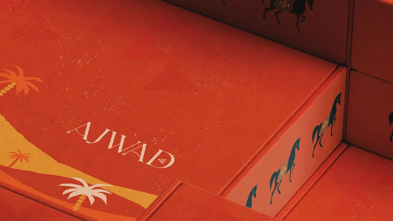
The national holidays in late February are another natural moment, with a lot of local pride in the air and plenty of activity on Instagram and Snapchat. A rebrand that leans on heritage, like the Sadu and desert patterns in the AJWAD gift-box identity, can feel at home here. The summer is the opposite case for storefronts: many families travel, malls are quieter in the day, and the sun on a south-facing sign is a good reason to test new colours outdoors before committing to a fabrication run.
We also time the switch around your own stock. If you have just printed a large run of bags or boxes, the plan can use them up for a set period on low-visibility channels such as wholesale orders, while customer-facing surfaces move first. Nothing about this needs to be wasteful, it only needs to be written down.
Social handles, names and telling customers
In Kuwait a brand often lives on Instagram first, so the handle is part of the identity. If the rebrand changes the name, the new handle needs to be secured on Instagram, Snapchat and TikTok before anything is announced, along with the matching domain. We check availability during Week 1 so the name direction is not chosen around a handle you cannot have.
Changing a username keeps your followers and posts, but the old handle can become available for someone else to claim once you release it, and old links and tags in stories will stop pointing to you. Some businesses keep the old handle as a small holding account that points to the new one. Others decide the old name has to go entirely. Either way it is a decision to make in the plan, not on the morning of the launch.
Telling customers is part of the design work. A short announcement in Arabic and English that explains what changed and what did not, a pinned post, updated highlight covers and a story sequence for launch day all come from the same files as the identity. If the reason for the rebrand is a real change, a new owner, a new range, a second branch, say it plainly. Customers in a small market notice everything, and an honest explanation lands better than a mystery.
If the rebrand involves a new name, protect it properly. Trademark registration in Kuwait is a Ministry of Commerce and Industry process, and our trademark registration guide explains the steps in plain language. We do not give legal advice, but we time the reveal so you are not announcing a name before you have started protecting it.
How a rebrand runs in 2–3 weeks
A rebrand is delivered in 2–3 weeks from the signed brief to the final files, the same schedule as a new identity, because the extra work is front-loaded into the brief rather than added at the end. Week 1 is the brief, the inventory of what to keep and drop, and the direction. Week 2 is the identity itself, in Arabic and English together. Week 3 is the applications, the guidelines and the switchover map. Our guide on how long branding takes explains what has to be true for that schedule to hold.
The schedule depends on one decision maker on your side and quick feedback. Rebrands in family businesses and partnerships often slow down because the decision belongs to several people who disagree about what to keep. We handle that by putting the keep-and-drop list in front of everyone in Week 1, before any new design exists, so the argument happens about the strategy rather than about a logo.
Production is separate from design. Signage, packaging runs and uniforms are made by Kuwait printers and signage makers on their own lead times, and we prepare print-ready files to their specifications and answer their questions. The switchover map shows those dates honestly, so the launch day is set by the slowest supplier, not by wishful thinking.
Price is quoted per scope and fixed before work starts. What drives it in a rebrand is mostly the number of surfaces to redesign and whether the Arabic mark needs to be drawn from scratch; our guide to branding cost in Kuwait lists the factors so you can compare quotes properly.
After the switch: one team for the brand and the marketing
A rebrand is only finished when customers stop seeing the old brand. That usually takes a few months of consistent posting, ads and packaging in the new identity. Because the same team runs social media management, we can carry the launch straight into the first content calendar, using the templates delivered in Week 3 rather than re-interpreting the guidelines.
If the rebrand reaches into your product, the same applies. A new identity often means a new app icon, a new splash screen and updated store screenshots, and our app branding work covers those surfaces. If the app itself needs to be rebuilt, we can do that through our app team, working from the same files.
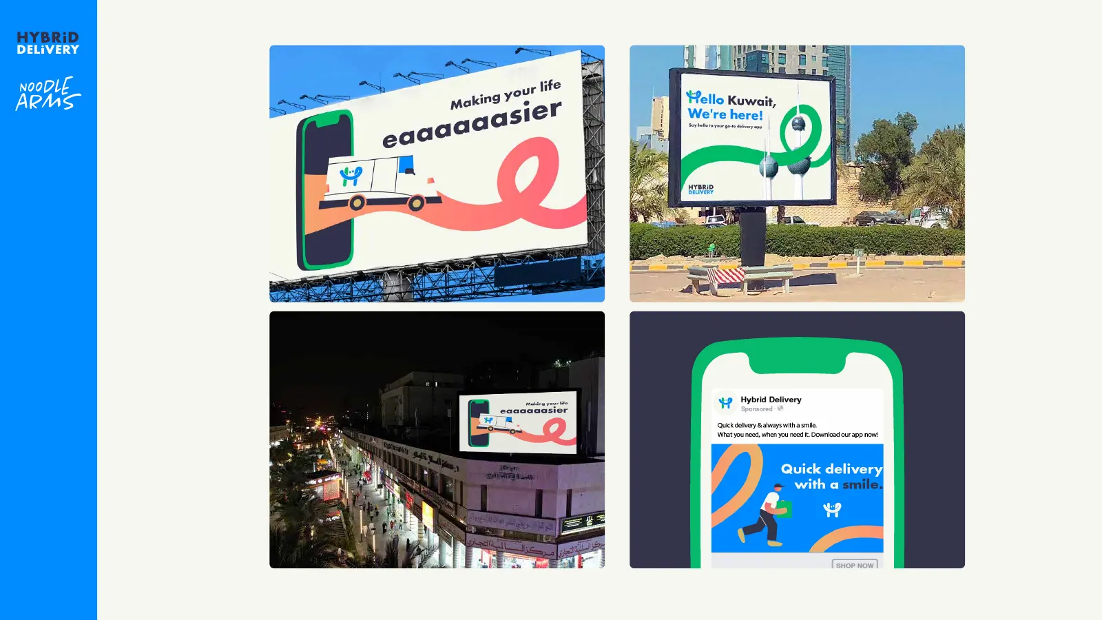
Many of the identities in our portfolio were built to run across many surfaces at once. Hybrid Delivery, for example, covers logos including an Arabic version, uniforms, van livery, billboards and the app's splash and UI, which is the kind of spread a switchover map has to account for. We show it not as a rebrand case study but as an example of how many surfaces a single identity has to reach on day one.
When you are ready, send us what you have today: photos of the sign, the packaging, a link to your Instagram and your delivery-app pages. We will tell you whether you need a refresh or a rebrand, quote the scope and book the 2–3 weeks. Start from the branding overview and send us a message from there.