
Why the Arabic mark has to be drawn with the English one
Latin and Arabic letters are built on different logic. English letters sit on a baseline and mostly stand alone; their height is governed by capitals and a lowercase x-height. Arabic is connected, flows right to left, changes shape depending on where a letter falls in the word, and puts much of its character above and below the line: dots, ascenders like alif and lam, descending tails on letters like ra, waw and noon. Set the same name in both scripts with two unrelated fonts and they will almost never look like they belong to the same business.
Drawing them together means making a set of decisions once and applying them to both. How heavy is the stroke? How much contrast between thick and thin? Are the corners sharp or rounded? Is the rhythm tight and condensed or wide and relaxed? When the Arabic and English answer those questions the same way, the two names read as one voice, even though the letters have nothing in common.
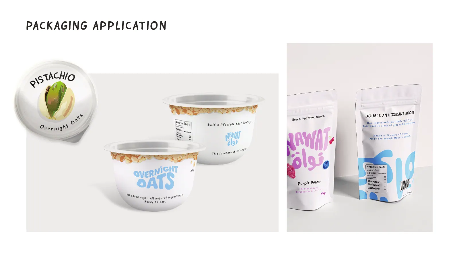
It also means letting each script lead where it is strong. Arabic can stretch horizontally, connect letters in ways Latin cannot, and stack forms vertically. Sometimes the Arabic version suggests a shape that the English then borrows, which is how a bilingual logo ends up feeling designed rather than translated. The portfolio entry for Nawat describes exactly this: bubble lettering drawn in Arabic and English together, followed by a custom display font.
None of this is possible if the English logo is finished and approved first and the Arabic is treated as a translation job at the end. By that point every decision has been made for the Latin letters, and the Arabic is forced to imitate shapes that do not exist in its alphabet. That is the most common reason a Kuwait storefront looks awkward in Arabic: not bad taste, but the wrong order of work.
What goes wrong when the Arabic is typed in afterwards
The problems are predictable, and you can probably spot them on signs you pass every day. The first is weight mismatch: a bold, chunky English wordmark next to a thin Arabic font that looks like a footnote, or the reverse. The second is size mismatch: someone scales the Arabic until its tallest letter matches the English capitals, and the body of the Arabic word ends up tiny, because so much of its height lives in the alif and lam.
The third is baseline conflict. Arabic letters hang from and dip below their line in ways Latin letters do not, so when the two names sit side by side, one looks like it is floating or sinking. The fourth is dots and marks: at small sizes or in thin weights, the dots that distinguish ba, ta and tha, or jeem, ha and kha, merge or vanish, and the name becomes harder to read. On embroidery and cheap print this happens even at reasonable sizes.
The fifth is ligatures and letter combinations. Your actual name may contain lam-alif, a run of connected letters that a font handles awkwardly, or a final letter whose tail collides with the English beside it. Fonts are designed for general text, not for your five specific letters. The sixth is transliteration: the Arabic and English names are spelled or pronounced differently, and nobody decided which one the logo should prioritise.
Each of these is fixable when the Arabic is drawn rather than typed. Weight can be matched by eye, size balanced by the body of the letters rather than the tallest stroke, baselines negotiated, dots enlarged and placed deliberately, awkward combinations redrawn. That is the difference between an Arabic font and Arabic lettering, and it is the core of what this service does. If you want to start with fonts, our guide to Arabic fonts for bilingual brands shows how to choose and pair them well.
Kuwait reads the Arabic first
On a Kuwait storefront the Arabic is usually what people read first, and often what they remember. Customers tell each other the name in Arabic, search for it in Arabic on Instagram and Google Maps, and type it in Arabic into Talabat. A brand that invested only in its English mark is putting its effort into the version fewer people actually say.
That has practical consequences for design. The Arabic usually needs to be legible from further away, because it is the version a driver looks for on a busy street in Salmiya or Shuwaikh. It needs to hold up when illuminated at night, which is how most signs in Kuwait are read for much of the year. And it needs to survive the summer sun, which bleaches thin strokes and pale colours on any fascia that faces it.
It also raises the question of which language leads. There is no universal rule. A brand selling to an international, English-speaking crowd at a mall may lead with Latin; a neighbourhood bakery, a heritage gift shop or a family clinic is often better served when the Arabic comes first. The answer comes from who buys and what they call you, and it is one of the first questions in our brief.
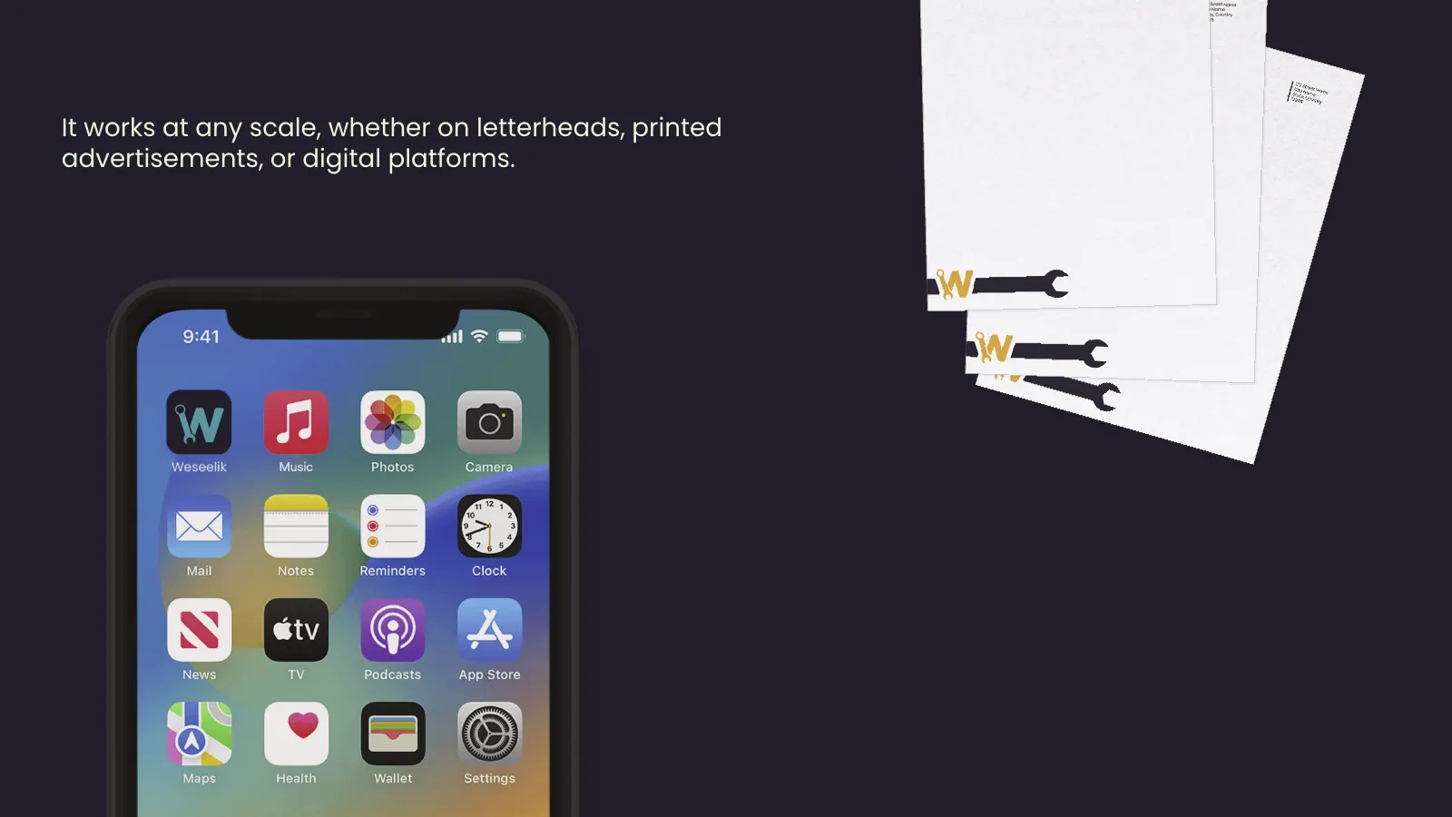
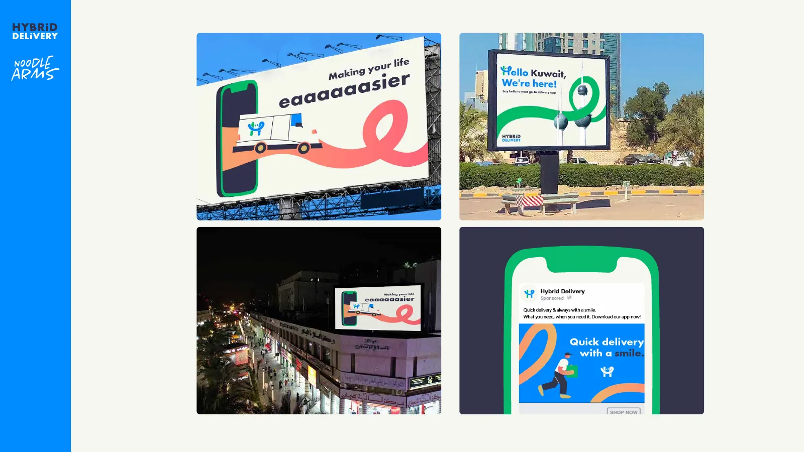
Then there is the name itself. Some brands have a natural Arabic name, others a coined English word that needs an Arabic rendering. Weseelik, written وصيلك, is in our portfolio as a bilingual logo with a spanner letterform; Hybrid Delivery was delivered with logos that include an Arabic version. In both cases the Arabic is a designed name, not a caption.
Choosing an Arabic style: lettering, Kufi, Naskh or calligraphy
Arabic has centuries of letterform traditions, and a logo can draw on any of them. Geometric Kufi builds letters from straight lines and right angles. It pairs naturally with modern sans-serif English, suits technology, retail and anything that needs to feel clean and structured, and it holds up well at small sizes and on signs.
Naskh-inspired lettering follows the rounded, readable forms of everyday Arabic writing and print. It feels familiar, warm and trustworthy, and pairs comfortably with English serifs and humanist sans. Many food, family and service brands sit here because it reads easily for every age group.
Calligraphic marks, drawing on Thuluth, Diwani or freer brush styles, carry the most character and the most risk. They can look beautiful on a perfume box or a heritage gift brand, but complex calligraphy often becomes unreadable at small sizes, in one colour or embroidered on a uniform. When a client asks for an Arabic calligraphy logo, we usually propose a calligraphic primary mark with a simpler secondary version for the places where detail dies.
Custom display lettering sits outside the traditions: bubble letters, stencil forms, hand-drawn shapes made to match a specific English mark. It is the route for brands that want personality over formality. Whatever the style, the rule is the same: the Arabic must match the English in weight, contrast and mood, and it must be tested at the smallest size it will appear. Choosing between these routes is part of Week 1, before any final drawing begins.
Bilingual lockups: side by side, stacked or separate
Once both names exist, they have to live together, and the arrangement matters as much as the letters. The side-by-side lockup puts Arabic on the right and English on the left, each reading toward the centre or away from it. It suits wide fascias and website headers, but it needs care, because the eye has to switch reading direction inside one logo.
The stacked lockup puts one name above the other, usually with the symbol on top or between them. It is the natural shape for a square profile picture, a cup lid or a sticker, and it makes the question of which language leads very visible: the top line is read first. The separate versions, Arabic only and English only, exist for surfaces that only need one script, such as an Arabic Snapchat ad or an English app-store listing.
Balancing the names is a matter of optical size, not measurements. Arabic often needs to be set larger than the English cap height to look the same size, because its letters spread across a taller vertical range. The gap between them must feel like one unit, not two logos parked next to each other. A symbol, when there is one, has to belong to both scripts equally rather than leaning on the Latin.
We usually deliver three to five bilingual and single-language arrangements, chosen from the surfaces the brand will actually use, rather than every theoretical combination. Each one comes in the colour versions and file formats described on our logo design page, so a printer, a sign maker and a developer can each pick the right file without guessing.
Testing the Arabic where it will actually be seen
An Arabic mark that looks fine on a designer's screen has not been tested yet. We put it through the surfaces where Arabic fails most often. Lit signage: Kuwait signage makers typically build channel letters, light boxes or neon-style signs, and each has limits on how thin a stroke can be and how close two dots can sit before they merge into one glow. We check the Arabic against those limits before it is final, not after the sign maker phones to say it cannot be built.
Small screens: the Arabic is checked inside an Instagram circle, on a Talabat or Deliveroo listing and as a WhatsApp Business profile picture, where it may be shown smaller than a fingernail. If the dots disappear at that size, the icon or a simplified Arabic version takes over. Print and fabric: business cards, bags, stamps and embroidered uniforms all thicken or blur fine detail, and Arabic, with its dots and tight joins, suffers first.
Single colour: many uses, from a rubber stamp to a laser-etched cup to a foil box, allow only one colour. A bilingual mark that relies on two colours to separate the Arabic from the English needs a version that still works without them. Reversed: white on dark changes how heavy the letters look, so reversed versions are adjusted by eye, not just inverted.
If the brand will become an app, the bilingual mark also has to produce an icon that works for Arabic and English users alike. That is covered with the brand on our app branding page. On the logo side, our job is to make sure there is a strong, simple shape inside the mark that can stand alone.
Adding Arabic to an existing English logo
Plenty of Kuwait businesses arrive with an English logo they like and customers recognise, plus an Arabic line that was typed in by whoever made the first sign. In that case we do not start over. We study the English mark, measure its stroke weight, contrast, corner treatment and spacing, and draw an Arabic counterpart that follows the same rules, then rebuild the lockups so the two sit together properly.
Sometimes the English needs small adjustments to meet the Arabic halfway: a slightly heavier weight, a tweak to spacing, a symbol moved so it serves both scripts. Those changes are usually invisible to customers, and they keep the recognition you have already built. If the problems run deeper, if the name, audience or offer has changed, it becomes a different project, covered on our rebranding page.
This route also suits brands entering Kuwait from abroad with an established Latin logo. The English mark cannot change, but the Arabic has to feel native to the market, not like a translation stuck on for compliance. Drawing it with care for both the original mark and Arabic letterform tradition is what makes the difference on a storefront in the Avenues.
Whichever way you arrive, the outcome is the same: an Arabic name that looks like it was always part of the logo, a full set of bilingual and single-language lockups, and files your suppliers can use. Everything we have delivered in Arabic and English is listed by project on our branding page.