What restaurant branding in Kuwait actually includes
Restaurant branding is the identity of a food concept across every place a guest meets it. That includes the name and logo, but it also includes the menu, the cups and bags, the sign over the door, the staff uniform and the small square tile that stands for you on Talabat and Deliveroo. We design all of these as one system, in Arabic and English, so nothing is left for a supplier to improvise.
Owners usually come to us asking for a logo, and the logo is where we start. But a café with a lovely logo, a generic printed cup, a menu laid out by the print shop and delivery photos shot on a phone under yellow light does not feel like a brand to the person ordering. Guests judge the whole experience, and they judge the bag and the screen before they taste anything.
A restaurant project with us therefore covers the name lockup in both languages, a colour and type system, a pattern or illustration style, the menu, the take-away packaging, signage artwork, uniform artwork and the assets for delivery apps and social media. It is the same thinking behind all of our branding work in Kuwait, shaped around how food businesses really run day to day.
If the name is still open, settle it early. A restaurant name has to sound right in Arabic and English, be free as an Instagram handle and be protected. Trademark registration is a Ministry of Commerce and Industry process, and our guide to trademark registration in Kuwait explains where to begin. We do not give legal advice, but we will not finalise artwork on a name you have not checked.
Built for how Kuwait orders: the delivery-app tile comes first
For many Kuwait restaurants and cafés, the first time a customer sees the brand is on a phone, scrolling a delivery app late in the evening. There your logo is cropped into a small square or circle, placed beside dozens of competitors, above a cover photo and a list of dishes. A detailed mark with thin lines and a long name simply disappears at that size.
We design a version of the identity specifically for that tile: a simplified mark or monogram that holds up as a thumbnail, a background colour that stands out against the app's white interface, and a cover image direction that shows the food rather than the interior. We also set the dish photography style, so the menu inside the app looks as considered as the menu on the table.
Delivery also changes what the brand looks like when it arrives. The bag, the box, the seal sticker and even the receipt are the restaurant for that customer. If the food comes in an unbranded foil tray inside a plain bag, the only logo left in their memory is the app's, not yours. The packaging side of this is covered in depth on our packaging design page.
A delivery-first concept should be judged at the size people actually see it. We review the logo tile and the dish photos on a real phone, in both the Arabic and the English interface of the app, before anything is signed off, because a mark that looks bold on a laptop can look timid in a crowded list.
The dine-in room, the signage and the street
A dine-in concept has to win attention from the street or the mall corridor. In Salmiya, along the Gulf Road, in Kuwait City's office districts and in the food halls of the Avenues, your sign competes with neighbours that are often bigger and brighter. It has to read from a moving car or across a corridor, in both scripts, and still look like the logo on the menu.
Kuwait's sun is a design constraint in its own right. Colours on outdoor signs and awnings fade, glossy panels glare in the afternoon, and thin light-box letters can look weak in daylight and overpowering at night. We choose signage colours and versions with that in mind and prepare artwork that local signage makers can fabricate, with the Arabic and English lockups at the right relative size. Arabic lettering for a sign is a craft of its own, and our Arabic logo design work feeds straight into it.
Inside, the brand carries through smaller things: the table talker, the take-away counter, the wall graphic, the Wi-Fi card, the staff uniform and the bill folder. None of these has to be expensive. But each one left to whoever happens to supply it pulls the room a little further away from the concept you paid to create.
We do not design interiors or manage fit-out. We work alongside your interior designer or contractor and give them the colours, the material direction, the patterns and the signage artwork, so the room and the brand look like they were planned together rather than introduced on opening day. If you have not appointed an interior designer yet, we can give you a one-page summary to hand to any contractor, with the colours, suggested materials and logo placement.
The menu is the brand's hardest-working page
Every guest reads the menu, usually more carefully than anything else you will ever print. That makes it the most important piece of restaurant branding after the logo, and in practice it is often the piece most left to chance. A menu has to sell in two languages at once, show prices clearly, lead the eye to the dishes you most want to sell, and survive being wiped down after every table.
We design the menu as part of the identity: the structure, the bilingual layout, the typography, the photography style and the printed format, from a single card at a café counter to a full booklet for a family restaurant. The same design then becomes the QR menu and the dish list on your delivery-app profile, so the three never contradict each other on a price or a description.
Kuwait menus also move with the calendar. Ramadan brings iftar and suhoor menus, summer brings cold drinks, and new dishes arrive all the time. We build the menu so your team can update it, with clear rules for adding an item or changing a price, rather than a file only the original designer can open.
We have written a separate, practical guide to menu design for Kuwait restaurants and cafés, covering layout, price display, photography and the delivery-app version in much more detail.
The take-away kit: cups, bags, boxes and uniforms
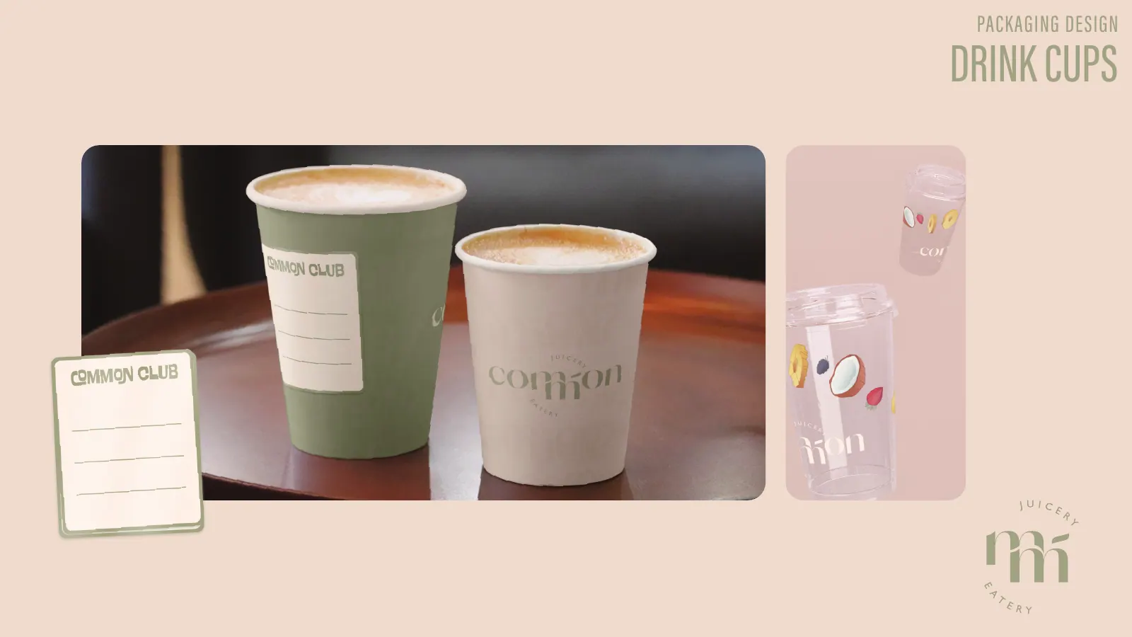
For cafés, juice bars and quick-service concepts, the cup is the logo people actually carry around. It is the object in the Instagram photo, the thing visible on a desk in an office tower and the item a customer holds while walking through a mall. A cup design that only puts a small logo in the middle wastes that free moment of visibility.
For Common Eatery, a juicery and eatery, we created a playful campaign look of hand-drawn fruit, wavy lettering and a Juicery · Eatery seal, and carried it across cups, bowls, bags, staff uniform and merch. The illustration did work a logo alone could not, turning every cup and bowl into a recognisable piece of the brand.
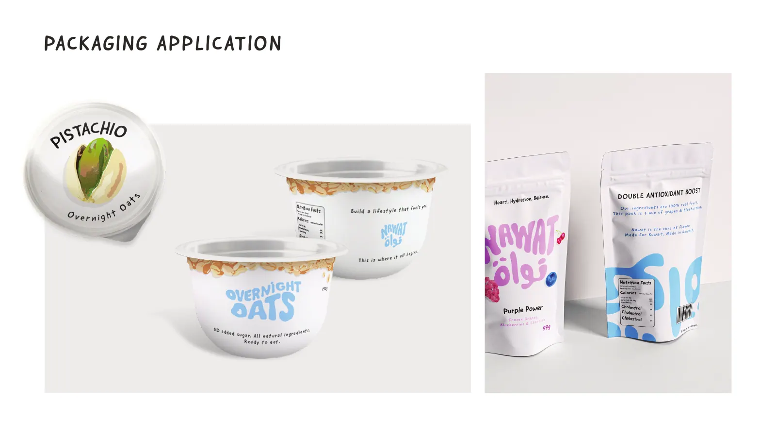
For Nawat, a healthy grab-and-go brand, the identity was built on bubble lettering drawn in Arabic and English together, watercolour ingredients and a set of flavour colours, applied to cups and pouches so each product could be told apart by colour before anyone read a word.
Uniforms deserve the same care. Staff are the brand in motion, they appear in every behind-the-counter reel, and a well-designed apron or cap is often what makes a small café look established. We design the uniform artwork and its placement, then supply files your uniform maker can produce without guessing.
Café, cloud kitchen, family restaurant or juice bar: different briefs
A specialty café lives on its cup, its counter and its Instagram. The identity needs a strong mark for the cup, a calm menu board that does not shout over the coffee, and a voice that suits the regulars who stop by every morning on the way to work.
A cloud kitchen may never have a dine-in guest. Its brand exists almost entirely on delivery apps and inside the bag, so we put the tile, the photography, the packaging and the seal sticker ahead of signage. Many operators run more than one virtual brand from the same kitchen, and each one needs to look like a genuinely different restaurant to the person scrolling.
A family restaurant in a mall or on a busy street needs signage, a full menu, a kids' section and an identity warm enough for weekend lunches and big gatherings. Arabic usually leads here, and the menu has to be easy for every generation at the table, from grandparents to teenagers.
A juice bar, dessert shop or bakery often sells as much on colour and illustration as on its name. Seasonal flavours, Eid gift boxes and catering trays come up quickly, so the system has to flex. And for a home kitchen or a pop-up, honestly, a good wordmark, one colour and clean photos on Talabat will do more than a full identity, and we will tell you if that is the stage you are at.
Ramadan, Eid and the content calendar
Food in Kuwait follows the calendar closely. Ramadan reshapes opening hours, menus and the whole visual tone of a restaurant; the hours before iftar are when people order, and the late nights around suhoor bring a second wave. Eid brings gifting and family gatherings, and the national holidays in February fill the city with flags and celebration.
A restaurant identity should include a seasonal layer that can be switched on for these moments without redesigning the brand: a Ramadan colour variation and pattern, a menu insert, Eid stickers for packaging, and templates for posts and stories. We design that layer as part of the system, so the season looks like your restaurant dressed up rather than a different restaurant.
Social media is where most of these seasons are announced, on Instagram, Snapchat and TikTok. We hand over templates for posts and stories, reel covers and highlight icons, and if you want the content produced and posted as well, our social media management team works from the same brand files, so a Ramadan campaign feels like the restaurant and not like a stock template downloaded the night before.
Second branches, ordering apps and keeping it consistent
The moment a concept opens a second branch, every inconsistency doubles. Different printers produce different reds, a new supplier redraws the logo for the bag, and someone builds a menu in a free template because the original file was lost. A brand system with clear guidelines and master files is what keeps branch two looking like branch one.
We hand over a guideline a branch manager can actually use: the logo versions and when each one applies, colour values for print, screen and signage, menu templates, packaging files and a short list of things not to do. Every file is yours, in editable form, so the next supplier starts from the original rather than a screenshot.
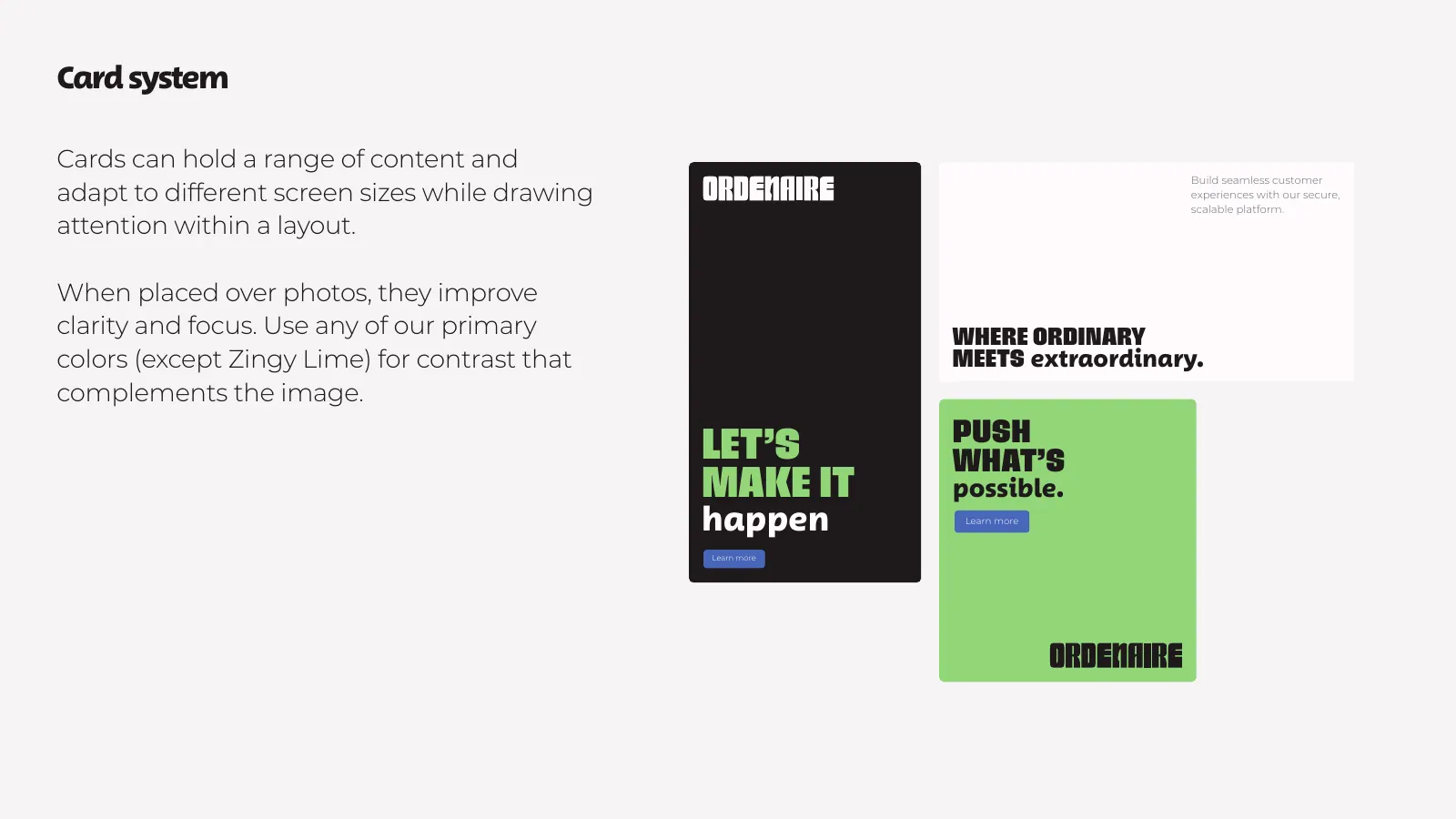
Some restaurant groups go further and want their own ordering experience. For Ordenaire, a restaurant ordering software brand, we designed a heavy wordmark with a knife motif and the Ordemark design system: colours, type, cards, spacing and icons a product team can build on.
If you want a branded ordering app for your own restaurant, the same team that designs the identity can design the screens and build the app, with KNET and Apple Pay at checkout and the Arabic interface treated as a first language rather than a mirror.
If you are opening a new concept or tidying up an existing one, send us the name, the menu and a few photos of the space on WhatsApp or through the contact page. We will tell you which parts of the system you need now and which can sensibly wait for the second branch.